In the digital age, the significance of UI (User Interface) and UX (User Experience) design cannot be overstated. As we navigate through a plethora of applications and websites, we often take for granted the seamless interactions that enhance our online experiences. However, behind every successful digital product lies a carefully crafted UI/UX design that prioritizes user satisfaction and engagement.
By understanding the importance of these elements, we can appreciate how they contribute to the overall effectiveness of a product, ensuring that users not only find what they need but also enjoy the process of getting there. UI/UX design serves as the bridge between users and technology. It encompasses everything from the layout and visual elements to the overall feel of an application or website.
When we invest time in creating an intuitive and aesthetically pleasing interface, we are not just enhancing usability; we are also building trust and loyalty among our users. A well-designed product can evoke positive emotions, encouraging users to return and engage more deeply. Thus, recognizing the importance of UI/UX design is crucial for anyone looking to create a successful digital experience that resonates with its audience.
Key Takeaways
- Good UI/UX design is crucial for creating a positive user experience and driving user engagement.
- A seamless user journey is essential for guiding users through the interface and achieving their goals efficiently.
- Visual hierarchy helps to prioritize information and guide users' attention for a clearer and more intuitive experience.
- Intuitive navigation enhances user experience by making it easy for users to find what they need and move through the interface.
- Mobile responsiveness is key for reaching a wider audience and providing a consistent experience across different devices.
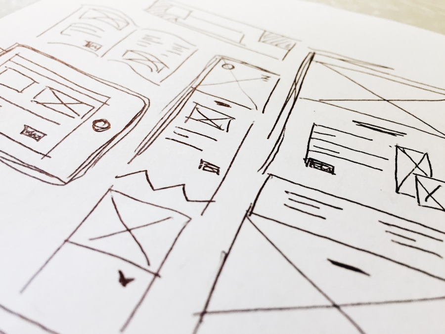
Creating a Seamless User Journey
To create a truly effective digital experience, we must focus on crafting a seamless user journey. This journey encompasses every interaction a user has with our product, from their first encounter to their ongoing engagement. By mapping out this journey, we can identify potential pain points and areas for improvement, ensuring that users can navigate our platforms effortlessly.
A seamless user journey not only enhances satisfaction but also increases the likelihood of conversion, whether that means making a purchase, signing up for a newsletter, or simply returning for more information. As we design this journey, it is essential to consider the various touchpoints that users will encounter. Each step should feel natural and intuitive, guiding users toward their goals without unnecessary friction.
We can achieve this by employing techniques such as user flow diagrams and journey mapping, which allow us to visualize the entire experience from the user's perspective. By prioritizing clarity and ease of use at every stage, we can create a user journey that feels cohesive and engaging, ultimately leading to higher retention rates and increased user satisfaction.
Utilizing Visual Hierarchy for Clarity
Visual hierarchy plays a pivotal role in UI/UX design, as it helps us organize information in a way that is easily digestible for users. By strategically arranging elements based on their importance, we can guide users' attention to key features and messages. This not only enhances clarity but also improves overall usability, allowing users to quickly find what they are looking for without feeling overwhelmed by cluttered interfaces.
When we think about visual hierarchy, we should consider factors such as size, color, contrast, and spacing. Larger elements naturally draw more attention, while contrasting colors can highlight important calls to action. By employing these techniques thoughtfully, we can create a visual landscape that communicates information effectively and intuitively.
Additionally, maintaining consistency in our design choices reinforces this hierarchy, helping users develop familiarity with our interface over time. Ultimately, by utilizing visual hierarchy effectively, we can create a more organized and user-friendly experience that resonates with our audience.
Implementing Intuitive Navigation
| Metrics | Value |
|---|---|
| Page Load Time | 3.2 seconds |
| Click-through Rate | 12% |
| Bounce Rate | 25% |
| Time on Page | 2 minutes |
Intuitive navigation is another cornerstone of effective UI/UX design. When users visit our website or application, they should be able to find what they need without confusion or frustration. A well-structured navigation system allows users to explore content effortlessly, enhancing their overall experience and encouraging them to engage more deeply with our offerings.
To achieve this, we must prioritize simplicity and clarity in our navigation design. One effective approach is to categorize content logically and use familiar terminology that resonates with our target audience. By grouping related items together and providing clear labels, we can help users understand where to find specific information or features.
Additionally, incorporating breadcrumbs or search functionality can further enhance navigation by allowing users to retrace their steps or quickly locate desired content. As we implement these strategies, we should continually test our navigation with real users to ensure it meets their needs and expectations. By focusing on intuitive navigation, we can create an experience that feels natural and user-friendly.
Optimizing for Mobile Responsiveness
In today's mobile-driven world, optimizing for mobile responsiveness is no longer optional; it is essential. As we design our digital products, we must recognize that users access content from various devices with different screen sizes and resolutions. A responsive design ensures that our applications and websites adapt seamlessly to these varying conditions, providing an optimal experience regardless of how users choose to engage with our content.
To achieve mobile responsiveness, we should employ flexible layouts and scalable images that adjust based on screen size. Additionally, touch-friendly elements are crucial for mobile users who rely on gestures rather than clicks. By prioritizing mobile-first design principles, we can create interfaces that are not only visually appealing but also functional across all devices.
As we continue to refine our designs for mobile responsiveness, we must remain vigilant about testing on multiple devices to ensure consistency and usability. Ultimately, by embracing mobile optimization, we can reach a broader audience and enhance user satisfaction.
Focusing on Accessibility and Inclusivity

As designers and developers, it is our responsibility to create digital experiences that are accessible and inclusive for all users. Accessibility goes beyond compliance with legal standards; it is about ensuring that everyone, regardless of their abilities or disabilities, can engage with our products effectively. By focusing on accessibility in our UI/UX design process, we can foster an environment where all users feel valued and included.
To enhance accessibility, we should consider various factors such as color contrast for visually impaired users, keyboard navigation for those who cannot use a mouse, and alternative text for images to assist screen readers. Additionally, incorporating features like adjustable text sizes and customizable color schemes can empower users to tailor their experience according to their needs. By prioritizing inclusivity in our designs, we not only expand our audience but also demonstrate our commitment to creating a more equitable digital landscape.
A/B Testing for Continuous Improvement
A/B testing is a powerful tool that allows us to make data-driven decisions in our UI/UX design process. By comparing two versions of a design element—such as a button color or layout—we can gather insights into user preferences and behaviors. This iterative approach enables us to refine our designs continuously based on real user feedback rather than assumptions or guesswork.
As we implement A/B testing, it is essential to define clear objectives and metrics for success. Whether we are measuring click-through rates or conversion rates, having specific goals in mind will help us evaluate the effectiveness of each variation accurately. Additionally, testing should be conducted with a representative sample of our target audience to ensure that the results are meaningful and applicable.
By embracing A/B testing as part of our design process, we can foster a culture of continuous improvement that ultimately leads to better user experiences.
Incorporating Feedback for Iterative Design
Incorporating user feedback is vital for creating designs that truly resonate with our audience. As we develop our products, seeking input from real users allows us to identify pain points and areas for enhancement that may not be apparent during the initial design phase. By actively listening to our users' experiences and suggestions, we can make informed decisions that lead to more effective UI/UX solutions.
To facilitate this feedback loop, we should establish channels for users to share their thoughts easily—whether through surveys, usability testing sessions, or direct communication on social media platforms. Analyzing this feedback helps us prioritize changes based on user needs and preferences while fostering a sense of community around our product. As we iterate on our designs based on user input, we demonstrate our commitment to creating an experience that evolves alongside our audience's expectations.
Ultimately, by incorporating feedback into our iterative design process, we can build products that not only meet but exceed user expectations. In conclusion, the world of UI/UX design is multifaceted and ever-evolving. By understanding its importance and focusing on key elements such as seamless user journeys, visual hierarchy, intuitive navigation, mobile responsiveness, accessibility, A/B testing, and user feedback incorporation, we can create digital experiences that resonate deeply with our audience.
As we continue to refine our skills in these areas, we will be better equipped to craft engaging products that not only meet user needs but also foster lasting connections in an increasingly digital world.
FAQs
What is UI/UX Design?
UI/UX design stands for User Interface/User Experience design. It involves creating the look and feel of a digital product, such as a website or mobile app, and ensuring that the user has a seamless and enjoyable experience while interacting with it.
What is the difference between UI and UX design?
UI design focuses on the visual and interactive elements of a digital product, such as buttons, icons, and layout. UX design, on the other hand, is more concerned with the overall feel of the product and how easy and enjoyable it is to use.
Why is UI/UX design important?
Good UI/UX design is crucial for the success of a digital product. It can impact user satisfaction, engagement, and ultimately the success of the product in the market. A well-designed UI/UX can also help in building brand loyalty and trust.
What are the key principles of UI/UX design?
Some key principles of UI/UX design include usability, accessibility, consistency, and simplicity. Designers aim to create products that are easy to use, visually appealing, and provide a seamless experience for the user.
What are some common tools used in UI/UX design?
Some common tools used in UI/UX design include Adobe XD, Sketch, Figma, InVision, and Axure RP. These tools help designers create wireframes, prototypes, and mockups to visualize and test their designs.